I’ve never run for president, but I assume that stepping into that ring requires a TON of moving parts and things to think about. Two important — scratch that — two vital aspects of a candidacy these days are one’s Web and social media presence. We should all know this by now. Barack Obama certainly does. He witnessed social media’s positive affects, especially among millennials, during both of his successful campaigns for the White House.
However today after missing by several hours the announcement that former Arkansas Governor Mike Huckabee is now the sixth GOP candidate to enter the 2016 race, I looked up his official Twitter account (@GovMikeHuckabee) to see what he’d said and how he’d made his announcement. To my surprise (Let’s get real, the Web nerd inside of me was actually horrified and slightly pissed off), there was NO such tweet!
#socialmediafail
Worse still, Huckabee/his campaign staff hadn’t tweeted since YESTERDAY. Y’all. That’s basically an eternity in the social-sphere, especially if you’ve been involved in breaking some big news!
Now, in all fairness to Huckabee, his Twitter account has since become more active today, though in my opinion there’s still no excuse for not having it updated at the time of his presidential announcement and for several hours following it. His staff easily could have taken 30 seconds to schedule a tweet to appear at the same time he was speaking.
Huckabee’s social media faux pas got me thinking about two other widely publicized campaign Web mistakes of late — Ted Cruz and Carly Fiorina’s failures to register important domain names. Unfortunately for them, they’re now both currently being mocked on tedcruz.com and carlyfiorina.org.
Again, I’m sure their staffs had a ton to think about leading up to their campaign announcements, but COME ON. This is 2015. Buy up your freaking domain names. All of them.
While we’re on the Web/social subject, today I decided to take a “stroll” around to all of the current presidential candidates’ websites to check out where/how they’ve implemented links to their social media accounts. While most of the sites are really pleasing to the eye (and humorously — to me, anyway — appear to have been designed by the same person), it was a mixed bag of successes and failures in regards to where their social icons were placed. Some candidates went with what I consider to be a success — “above the fold” visibility. A few others failed in my book with tiny or “below the fold,” and therefore seemingly less important, social links. Below are some screenshots I took to compare the candidates’ websites as well as the location of links to their social media accounts.
Thumbs up for…
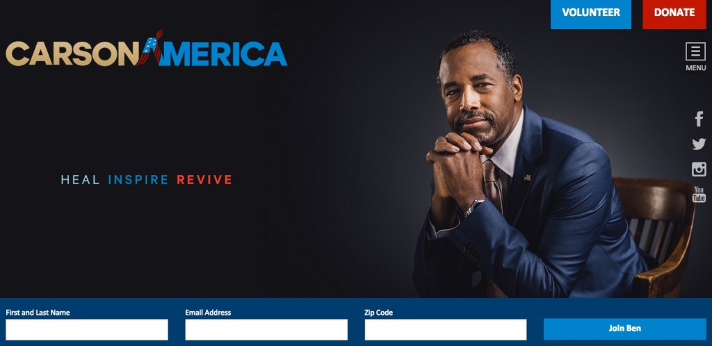
Ben Carson (R) – I really like his image choice, pleasing color scheme, and simple yet sleek site design, and better still – his social links are in a prominent location on the homepage.
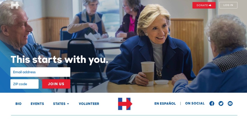
Hillary Clinton (D) – She, too, has her social links up top. She also has three additional instances of social links/social sharing buttons on her home page. Good job, HillDog.
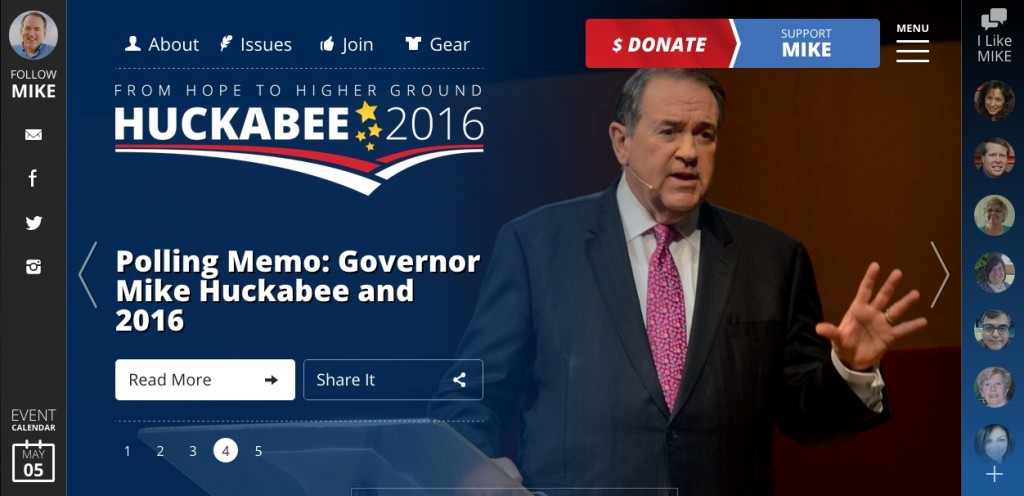
Then there’s Mike Huckabee (R). While I’m not a big fan of his site’s design, I’m happy to report that his social media links are prominently displayed on his home page. Hooray.
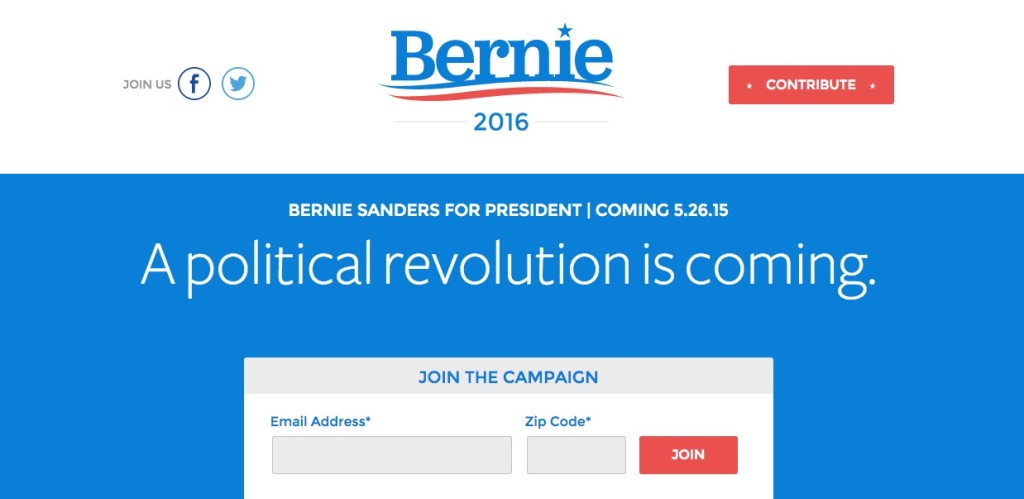
Next up, ‘ole Bernie Sanders (Independent running as a Democrat). Though his full site hasn’t launched yet, the temporary one does include social links not once, but twice on the page.
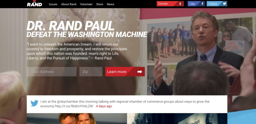
And rounding out the list of success stories — Rand Paul (R). I honestly think that the video that plays as the site’s background is a bit much, but not only does the Senator have some social links at the very top of his site, he also has several of his most recent tweets rotating on display. Nice touch.
I’ve got two thumbs in the middle for…
Ted Cruz (R) — NOT a fan of that video image of him (they couldn’t find a more flattering screen grab?!), but his site is simple and straightforward.
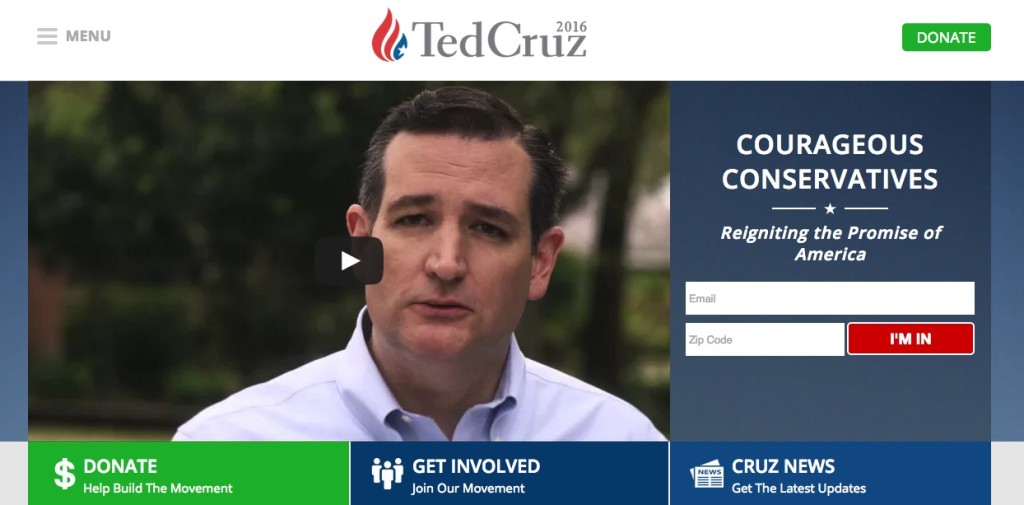
He doesn’t have his social links at the top of the home page, but he does somewhat redeem himself with some BIG social buttons further down the page.

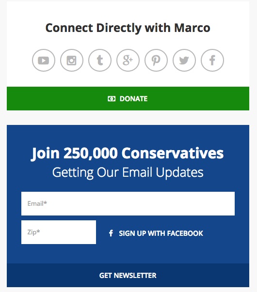
Marco Rubio (R) is in a similar boat. He also doesn’t include any links to his social media accounts towards the top of his home page. However, I do like the content he has on his site; one gets a more up-front, well-rounded view of who he is, rather than just reading about highlights from his life on a simple bio page. His site even features links to videos of some of his speeches and recent media interviews.
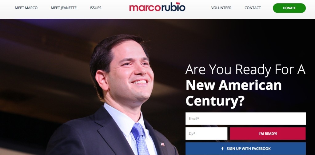
Further down the home page, there are two prominent ways to connect with Rubio, which notably include more than just your standard Twitter and Facebook links. Rubio is also on YouTube, Instagram, Tumblr, Google+, and Pinterest. Nice.
 And now for the thumbs down. It goes to…
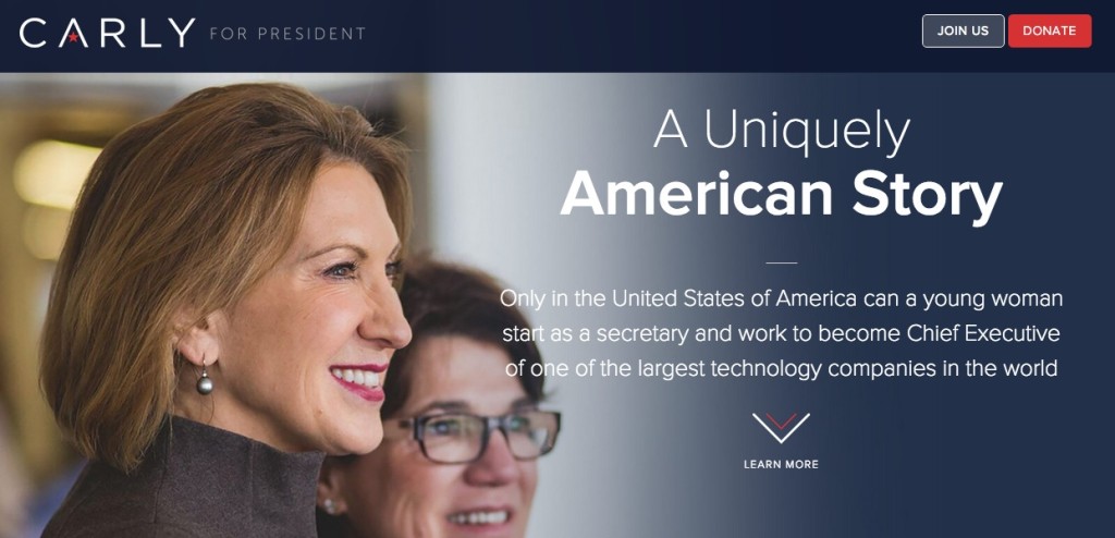
Carly Fiorina (R) — I’m sad about this, because I really like Fiorina’s website. Like Carson’s, it’s got a slightly more subdued patriotic color scheme and it’s simple and sleek. However, she’s got the two smallest Facebook and Twitter icons I’ve ever seen! Worse still, they’re at the very bottom of her website. Tisk tisk.
